Social Disparities of Sea Level Rise in Miami?
Final Project GEO 503
Hannah Stokes
Introduction
Projected impacts of sea level rise (under different scenarios) along the US coast may demonstrate differential impacts in affected demographic groups. In this project, I look at three Florida counties that cover the extensive stretch of the Miami urban area: Miami-Dade County, Broward County, and Palm Beach County. I compare projected spatial impacts of sea level rise to spatial socio-economic data from the US 5-year American Community Survey (ACS) to detect any possible correlations between sea-level rise (and subsequent risk from storm surges) and socio-economic indicators. An investigative article published through the group Climate Central details how rising sea levels and flooding in Atlantic City is disproportionately affecting low-income residents, and suggests that this may be the case in other coastal US cities (Upton, 2017). Additionally, this year we have seen tremendous damage from hurricanes in the Caribbean and Gulf of Mexico. The increasing frequency of strong hurricanes likely relates to climate change, and this will couple with rising sea levels in causing further damage to coasts and islands in the future. I hypothesized initially that I would find find greater levels of flood/storm surge risk to lower-income neighborhoods, and perhaps to ethnic minority neighborhoods, or that I might find the exact opposite due to high-value coastal properties, but predicted that I would find a weaker correlation for middle-income communities. There are also significant human elements that impact overall vulnerability to flood damage, including man-made systems for controlling flows of water, building materials, permeability of the ground, insurance coverage, and others, but I did not include them in this study.
Materials and methods
My approach to addressing my research question entailed several steps, as outlined below. In short, the approach was to access both elevation and income data for the three Florida counties, and compare the two based on projected sea level rise scenarios.
I loaded the following packages in order to complete the project:
library(dplyr)
library(ggplot2)
library(maps)
library(spocc)
library(knitr)
library(tidyr)
library(raster)
library(rasterVis)
library(scales)
library(rgeos)
library(maptools)
library(sp)
library(rgdal)
library(sf)
knitr::opts_chunk$set(cache=TRUE,warning=FALSE, message=FALSE, echo=TRUE) # cache the results for quick compiling- First, I downloaded the Global Administrative Areas (GADM) boundary files for the three Florida counties named above, and then combined these three into a single polygon using the “rbind” operation.
us=getData('GADM', country='USA', level=2)

fl1<-subset(us,NAME_1=="Florida")
brwd<-subset(fl1,NAME_2=="Broward")
mi_da<-subset(fl1,NAME_2=="Miami-Dade")
plmbch<-subset(fl1, NAME_2=="Palm Beach")
comb<-rbind(brwd,mi_da,plmbch)- Next, I downloaded the NASA Shuttle Radar Topographic Mission (SRTM) elevation data for the SRTM tile containing Florida, based on the centerpoint coordinates of that tile. This gave me elevation data for all of Florida. I then created a mask of the Florida elevation data based on the polygon boundary from step 1, and cropped the elevation data to the polygon extent, resulting in a plot of just the elevation data for the three counties.
dem_fl<-getData("SRTM",lon=-82.5,lat=27.5)
miami_mask<-mask(dem_fl,comb)
miami_cropmask<-crop(miami_mask,comb)
spplot(miami_cropmask, main="Elevation of Southern Florida (meters)",col.regions=terrain.colors(51),cuts=50)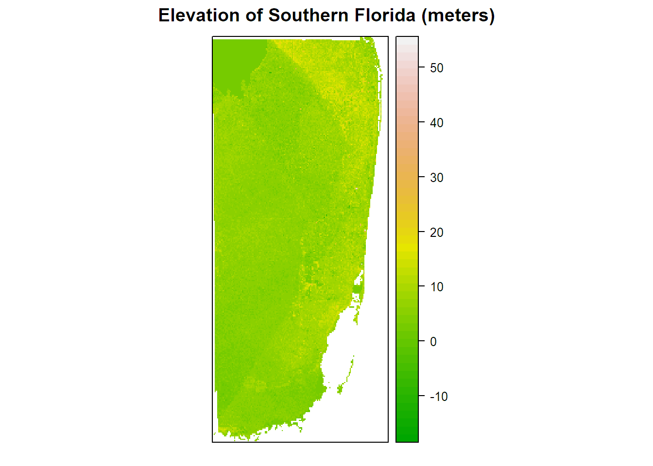
- Third, I created a set of side-by-side plots (plot in results below) showing the land under three different elevations, based on the storm surge and sea level rise projected scenarios. My attempts to locate historical storm surge ranges for the three counties yielded very little information. I was only able to find a list from the National Weather Service stating that the largest storm surge in Florida was 15ft in 1926, and an article (cited below) that looks at prehistorical storm surge evidence for the Gulf Florida coast, suggesting that storm surges could potentially be far worse than anticipated. With the difficulty of finding an exact storm surge range for these counties, I substituted ranges known ranges from Bangladesh in order to complete the model (Karim & Mimura, 2008).
layer1 <- miami_cropmask<=2.76
names(layer1)="Sea Rise 2.76m"
layer2 <- miami_cropmask<=5
names(layer2)="Sea Rise 5m"
layer3 <- miami_cropmask<=10.97
names(layer3)="Sea Rise 10.97m"- Next, I created a map of the socio-economic data (in this case, just income data). I downloaded the block group boundaries from TIGER for all of Florida from 2015, and also downloaded an excel data file of median household income by block group for the 3 Florida counties from the US Census Bureau Factfinder website, from the 2015 ACS.
wd="C:/Users/Hannah/Documents/School/UB/R/Final Project/Data/Florida Data"
tiger_bg_bound<-readOGR(file.path(wd,"tl_2015_12_bg_2015FloridaBG"),layer="tl_2015_12_bg")
income_3county <- read.csv(("ACS_15_5YR_B19013_with_ann.csv"),header = TRUE)- I joined the income data to the boundary file, in order to be able to map the income data by block group. I needed to convert the income column from factor to numeric in order to be able to use the data for my purposes.
income_map <- merge(tiger_bg_bound,income_3county,by.x="GEOID",by.y="GEO.id2")
income_map2 <- income_map[complete.cases(income_map@data), ]
income_map3 <- fortify(income_map2)
income_map2$id <- row.names(income_map2)
income_map3 <- left_join(income_map3,income_map2@data,by="id")

income_map3$HD01_VD01 <- as.numeric(as.character(income_map3$HD01_VD01))- Using the second sea level rise scenario (which we can visually see yields the greatest variability in areas at risk of flooding - the first scenario yields very little, and in the third scenario almost all of southern Florida is at risk), I calculated and mapped (below in results) the proportion of raster cells at risk of flooding for each block group, based on overlaying the raster elevation data with the block group income data.
income_map4 <- spTransform(income_map2, projection(layer2))
income_map4$HD01_VD01 <- as.numeric(as.character(income_map4$HD01_VD01))

l2 <- as.data.frame(layer2, xy = TRUE, na.rm = TRUE, centroids = TRUE)
coordinates(l2) <- ~ x + y
proj4string(l2) <- projection(layer2)

zone_over<- over(income_map4, l2, fn = mean)

income_map4$id <- sapply(slot(income_map4, "polygons"), slot, "ID")
zone_over$id <- row.names(zone_over)

income_map4 <- merge(income_map4, zone_over, by = "id", all.x = TRUE)

income_map4_2 <- fortify(income_map4)
income_map4$id <- row.names(income_map4)
income_map4_2 <- left_join(income_map4_2,income_map4@data,by="id")- I wanted to also include a map of the sea level rise data from NOAA for the 3 counties, but challenges in working with the socio-economic data did not allow me enough time to also work on successfully using this NOAA data in R.
Results
The first map I was able to create shows the distribution of income by block group for the three counties:
plot_income3 <- ggplot(income_map3,aes(x=long,y=lat,order=order,group=group,fill=HD01_VD01))+geom_polygon()+scale_fill_gradient(low="white",high="darkred",na.value = "grey50",name="Income (USD)")+coord_map()+ggtitle("2015 Household Income by Block Group")
plot_income3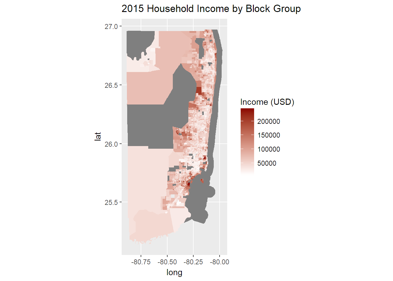
The next map shows the areas that would be at risk for flooding under the three different sea level rise scenarios, as described in my methods:
spplot(stack(layer1,layer2,layer3), main="Flood Risk Area under Three Sea Level Rise Scenarios Plus Storm Surge",col.regions=brewer.pal(9,"YlGnBu"), cuts = 8)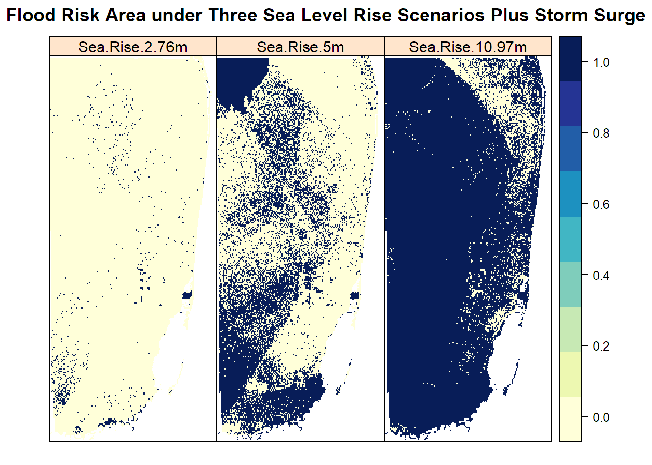
Using the information from the second scenario map (5m), we can map the proportion of raster cells falling within each block group that are at risk of flooding. Darker red block groups have a higher number of cells within it that are areas at risk of flooding in proportion to the total number of cells in that block group:
ggplot(income_map4_2,aes(x=long,y=lat,order=order,group=group,fill=Sea.Rise.5m))+geom_polygon()+scale_fill_gradient(low="white",high="darkred",na.value = "grey50",name="Proportion")+coord_map()+ggtitle("Proportion of Area at Risk Per Block")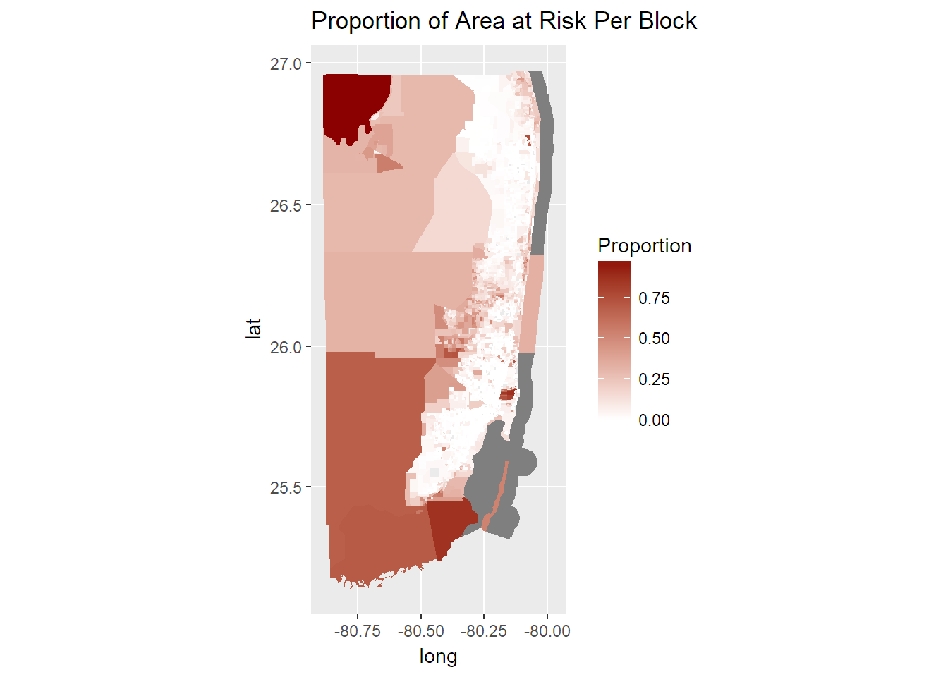 Based on the proportion of cells at risk of flooding within each block group, I calculated the correlation between proportion and income. While the results are significant (low p-value), we can also see from these results that the R-squared value is extremely low, showing a very weak relationship between the two variables:
lm_layer2 <-  lm(HD01_VD01 ~ Sea.Rise.5m, data = income_map4)
summary(lm_layer2)
##
## Call:
## lm(formula = HD01_VD01 ~ Sea.Rise.5m, data = income_map4)
##
## Residuals:
## Min 1Q Median 3Q Max
## -63625 -21964 -7351 13576 191513
##
## Coefficients:
## Estimate Std. Error t value Pr(>|t|)
## (Intercept) 53736.6 633.2 84.862 <2e-16 ***
## Sea.Rise.5m 44564.7 4787.7 9.308 <2e-16 ***
## ---
## Signif. codes: 0 '***' 0.001 '**' 0.01 '*' 0.05 '.' 0.1 ' ' 1
##
## Residual standard error: 31820 on 3257 degrees of freedom
## (56 observations deleted due to missingness)
## Multiple R-squared: 0.02591, Adjusted R-squared: 0.02561
## F-statistic: 86.64 on 1 and 3257 DF, p-value: < 2.2e-16Plotting the two variables together helps to visually demonstrate the weak relationship found from calculating their correlation:
ggplot(income_map4@data, aes(x = HD01_VD01, y = Sea.Rise.5m)) +
  geom_point(color = "blue") +
  geom_smooth(method = lm, color = "red") +
  labs(x = "Income", y = "Proportion") +
  ggtitle("Relationship between Income and Proportion at Risk")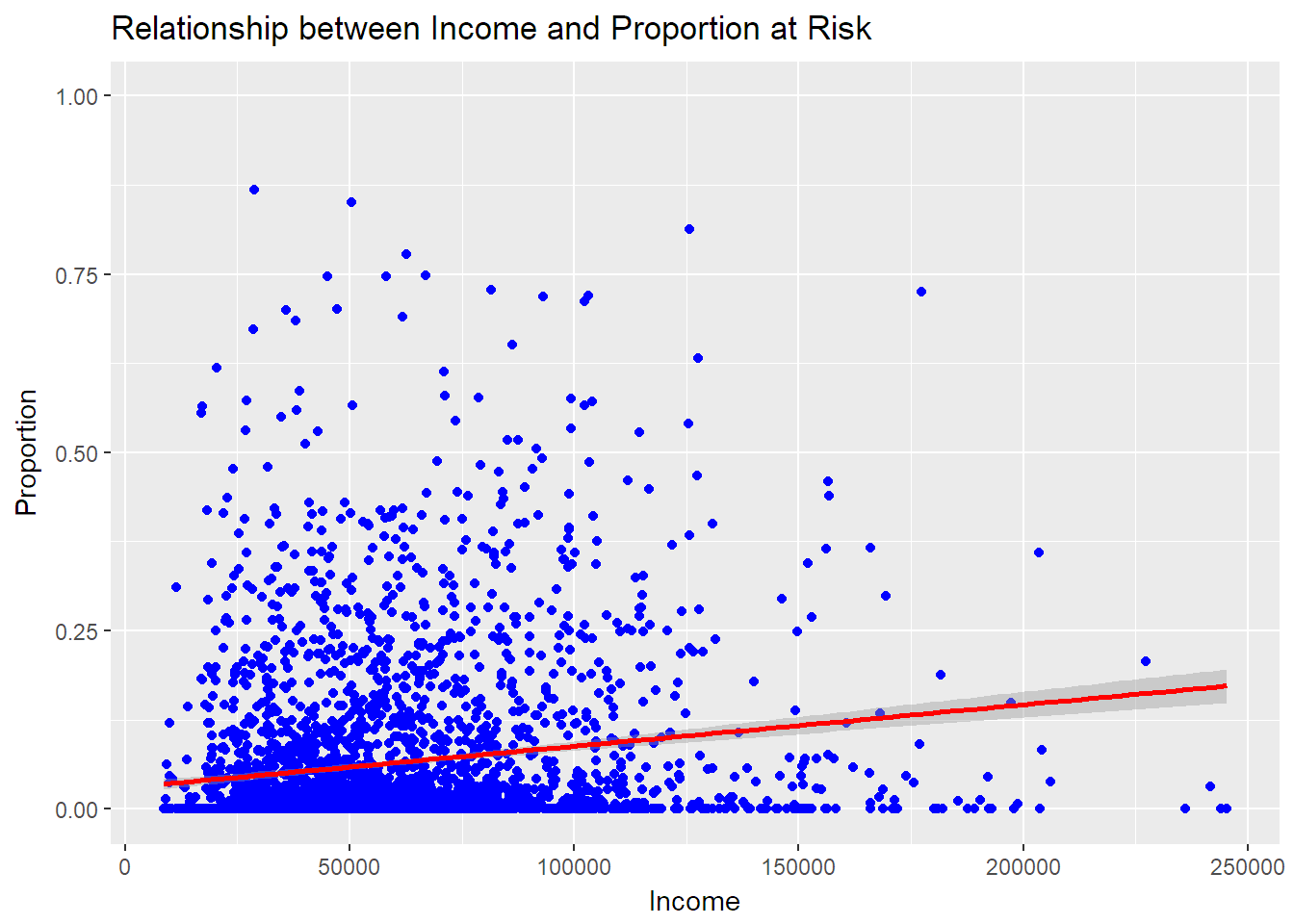
Conclusions
From these results I can conclude that there is a very weak relationship, if any, between income per block group and areas at risk for flooding under the second sea level rise scenario. What is also very clear from having mapped the three scenarios for sea level rise is that under the most extreme scenario, almost all of Florida is affected by sea level rise, thus making the comparison to income by block group an irrelevant question. What is interesting in the second scenario is that most of the remaining unaffected area is the area of the largest population density, with instead the low-population areas being almost entirely affected by sea level rise (if the water is able to reach inland). This would likely affect farmland and conserved areas, but not many Florida residences. The question of correlations between affected areas and income/race might be most relevant for the second scenario, and it would also be helpful to look at agricultural production that would be affected.
References
Karim, M. F., & Mimura, N. (2008). Impacts of climate change and sea-level rise on cyclonic storm surge floods in Bangladesh. Global Environmental Change, 18(3), 490-500.
Kulp, S., & Strauss, B. H. (2017). Rapid escalation of coastal flood exposure in US municipalities from sea level rise. Climate Change, 142, 477-489.
Lin, N., Lane, P., Emanuel, K. A., Sullivan, R. M., & Donnelly, J. P. (2014). Heightened hurricane surge risk in northwest Florida revealed from climatological-hydrodynamic modeling and paleorecord reconstruction. Journal of Geophysical Research: Atmospheres, 119(14), 8606-8623.
Tebaldi, C., Strauss, B. H., & Zervas, C. E. (2012). Modelling sea level rise impacts on storm surges along US coasts. Environmental Research Letters, 7, 1-11.
Upton, J. (2017). The injustice of Atlantic City’s floods. http://reports.climatecentral.org/atlantic-city/sea-level-rise/